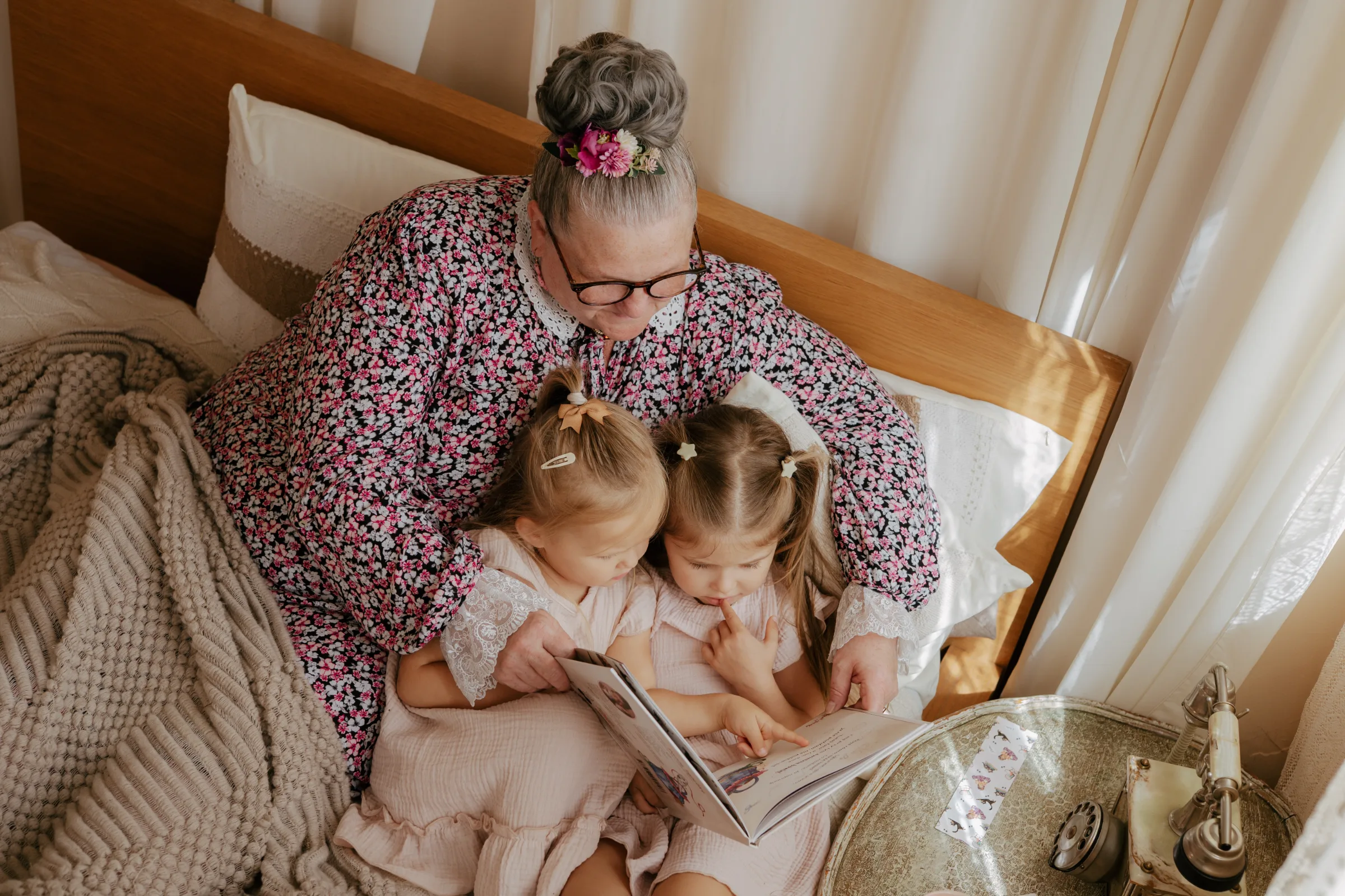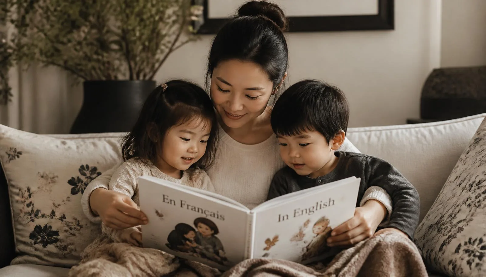
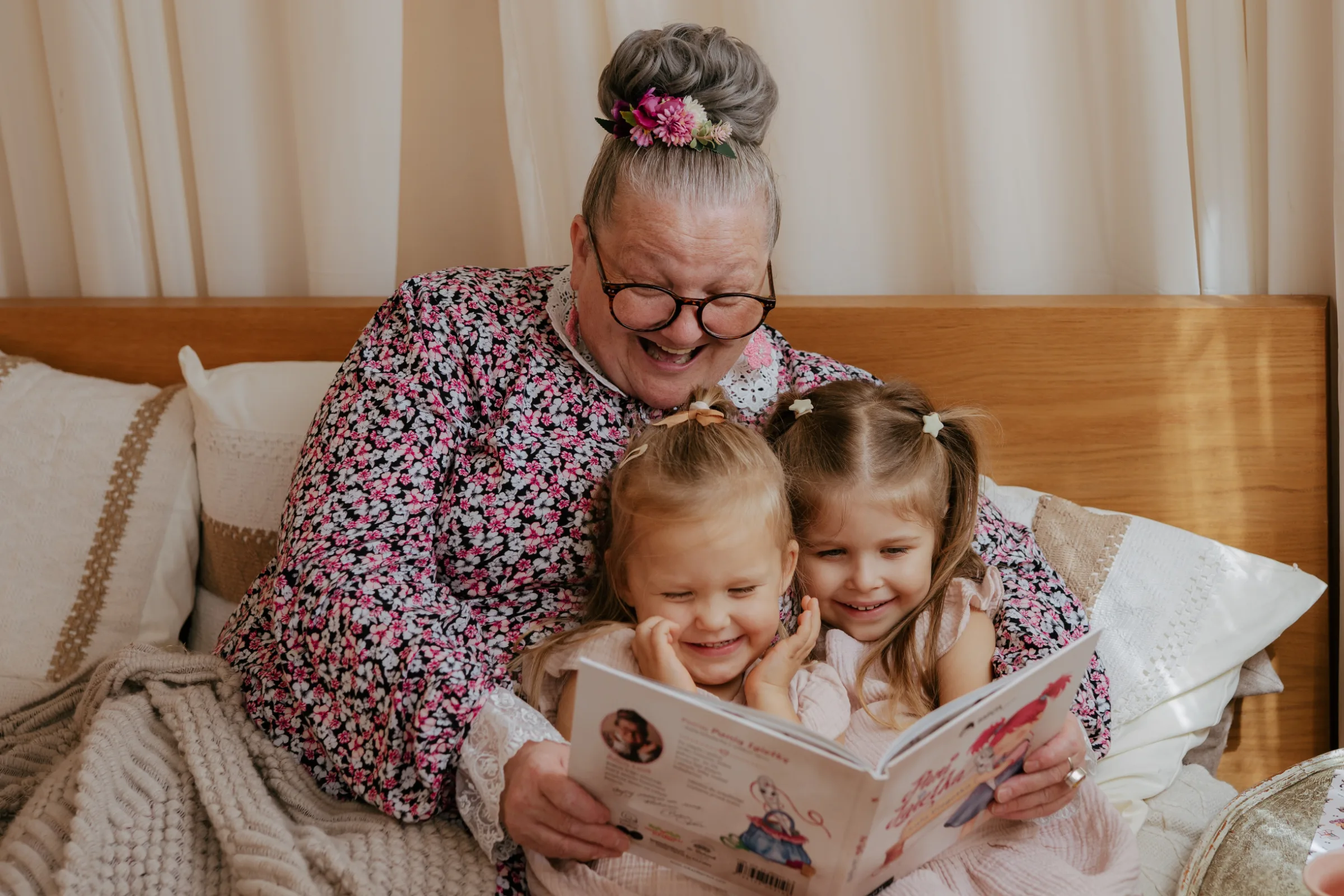
A children's book is an object: touched, carried around the house, held on laps and sometimes slept on. Its form is not an accessory to the content — it is part of it.
Paper that doesn't tire the eyes
Thick, matte paper doesn't reflect lamplight and doesn't distract. Colours look deeper and illustrations calmer — the child stays with the page longer.
Typography designed for beginner readers
Letterforms that are clearly distinct — where a "b" is not a mirror image of a "d" — genuinely make independent reading easier. Large type and generous line spacing keep the text from overwhelming.
A binding that survives hundreds of openings
A sewn block opens flat and doesn't fall apart after a month. That is the difference between a book for one season and a book that reaches a younger sibling.
A good edition is a form of respect for the reader. Children feel it, even if they cannot name it.